♨
The Emblem
Flame, oak leaf, and coffee bean combine into a compact, recognizable symbol.
A warm, character-rich identity created for a fictional artisan coffeehouse built around craft, conversation, and memorable everyday rituals.
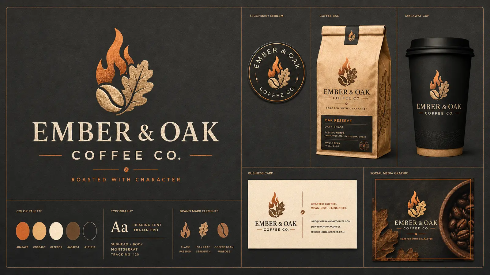
Ember & Oak was imagined as an independent coffeehouse that values patient roasting, welcoming conversation, and lasting community. The identity needed to feel refined without becoming formal, rustic without appearing dated, and distinctive enough to work across packaging, signage, merchandise, and digital media.
The brand system translates the company’s fictional values into recognizable visual elements.
The flame communicates warmth, energy, roasting craft, and the spark of conversation.
The oak leaf represents strength, patience, natural character, and something built to last.
The bean connects the story directly to the product and unifies the emblem into one memorable mark.
The identity extends consistently across the primary logo, secondary seal, packaging, cup, business card, and social-media presentation.
Every element reinforces the same warm, premium experience while remaining flexible across print and digital applications.
Flame, oak leaf, and coffee bean combine into a compact, recognizable symbol.
Ember copper, warm cream, kraft tan, oak brown, and charcoal create depth without losing approachability.
A confident serif display face gives the name heritage and substance. A clean supporting sans serif keeps information readable and contemporary.
Ember & Oak Coffee Co. is a fictional business created by REP·RE·SENT U STUDIOS as a self-initiated portfolio concept. It demonstrates our approach to brand strategy, visual identity, packaging presentation, and coordinated marketing design.
Tell us about your business, audience, personality, and goals. We’ll help turn your vision into a professional visual identity.
Start a Similar Project